For this week's Makeover Monday, I created a dashboard to better explore the data set. Here's a video highlighting how to take advantage of all the filters in the dashboard.
Hi, I've just seen your updated version (which looks great by the way) and I saw you added a button to toggle between metrics. How did you do this please?
Hello, thanks for your interest! I used the optional metrics feature to enable the toggle. Here's the Data Studio Help Centre Article on it - https://support.google.com/datastudio/answer/9484925?hl=en
Thankyou so much. I must have somehow missed this feature. Very useful. By the way the sunshine hours one is fantastic. Can't wait for you to publish this. Creating these is beyond me so rely on clever people like you to make them. Thanks again and keep up the great work your doing
For this week's Makeover Monday , I made a 4 sided radar chart in Data Studio (DS) with the built in area chart. Note: This method works well for 4 sided radar charts but may not work with more variables due to limitations within Data Studio 1. Data Preparation Date for X values An area chart in DS requires a date for the X axis and a metric for the Y axis. Since I wanted to put Spring/Fall on the Y Axis and Winter/Summer on the X axis, I had to convert the Spring/Fall percentages to dates. I did this by choosing Jan 1 2019 (an arbitrary date) to be "0" and added/subtracted by the percentage point to get the final date values. Use a top and bottom area chart My area chart is actually composed of two area charts - one for the top and bottom. The reason for this is because DS doesn't handle negative Y values well and the background colour gets affected. You'll get something like Figure 1 if you use a negative Y value and it would be a hassle to fix the ba...
Quickness in action indicates interest ie. eating tasty food quickly - even if you don't have previous memories (samskaras) about food running out. Controlled, deliberate, measured slowness combined with intentionality of action is power Gratitude is the act of selectively cultivating happiness or reframing negatives to neutrals or positives It's amazing how nothing comes to mind and thoughts disappear like bugs scuttling away when you shine a light on them. (Light = attention, focus, or an intention to speak or write cohesively)
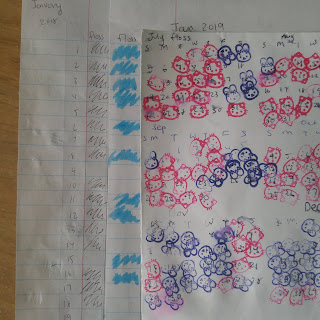
Flossing was not a habit engrained in me as a child and it's taken many years before I could make it one. Originally, I had tried marking my progress every day similar to what's suggested by the X effect. Unfortunately, I couldn't keep steady progress for longer than a month, especially after January when my resolutions faded. I was finally able to build a stronger habit by making two changes. 1) [Make it simple and less of a chore] Placing the floss in my shower so I could save time and effort. Previously, I flossed right before brushing my teeth but often skipped it because it felt like a tedious step. 2) [Find a method that increases your motivation] Changing up my scorecard to use stamps instead of drawing a pattern or highlighting. The stamps gave me extra motivation as they had a cute design and made me happy to see :) In the end, after 6 months of the "revised" system, I was able to build up the habit and no longer needed the scorecard to keep track. ...


Hi, I've just seen your updated version (which looks great by the way) and I saw you added a button to toggle between metrics. How did you do this please?
ReplyDeleteHello, thanks for your interest! I used the optional metrics feature to enable the toggle. Here's the Data Studio Help Centre Article on it - https://support.google.com/datastudio/answer/9484925?hl=en
DeleteThankyou so much. I must have somehow missed this feature. Very useful.
DeleteBy the way the sunshine hours one is fantastic. Can't wait for you to publish this. Creating these is beyond me so rely on clever people like you to make them.
Thanks again and keep up the great work your doing