Posts

Showing posts with the label data visualization

Side by Side: Intro & First Project

Image
What is Side by Side? A project where I'll remake my Data Studio visualizations in Tableau Why? Google Data Studio is the first data visualization software I learned to use and I found it easy to pick up. However, I know that Tableau has a larger community and recognize that Tableau has many features that Data Studio doesn't support. I have tried to make visualizations purely in Tableau but found it challenging to master the interface. I'm using this Side by Side series as an opportunity to learn Tableau. Having a pre-existing visualization as a guideline will help me focus more on learning Tableau capabilities and worry less about design decisions. ------------------------ Project 1: Words in Info We Trust I'm starting off with my Info we Trust visualization as it was very simple to make in Data Studio. However, I've learned that what may be simple to make in one software may not be as simple to make in another. Final viz in Tableau: ...
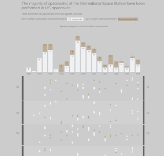
Creation of ISS Spacewalks - Makeover Monday

Image
Earlier this year, I created one of my first Makeover Mondays on Spacewalks . This post walks through my data preparation steps and considerations I made while creating the visualization. Preparing the data set 1. Examine the data set for completeness  I sorted each column to find missing data. The Spacewalkers column had some "n/a" fields so I filled in these values manually. 2. Add extra information to data set I wanted to add the nationalities of the Spacewalkers and countries of the spacesuits to the data set.  For the nationalities, I used a vlookup to append the data based on the name. However, I did have to be careful about different name spellings used in the data set compared to Wikipedia .  As for the spacesuits used in a spacewalk - I entered this manually based on the footnote symbols in Wikipedia . American spacesuits and Russian spacesuits were used depending on where the mission took place.  3. Final check I recreated the ori...

How to use: Events Industry & UN SDG Dashboard

Image
For this week's Makeover Monday, I created a dashboard to better explore the data set.  Here's a video highlighting how to take advantage of all the filters in the dashboard. 

Tip: Create a radar chart in DS using built-in area charts

Image
For this week's Makeover Monday , I made a 4 sided radar chart in Data Studio (DS) with the built in area chart. Note: This method works well for 4 sided radar charts but may not work with more variables due to limitations within Data Studio 1. Data Preparation Date for X values An area chart in DS requires a date for the X axis and a metric for the Y axis. Since I wanted to put Spring/Fall on the Y Axis and Winter/Summer on the X axis, I had to convert the Spring/Fall percentages to dates. I did this by choosing Jan 1 2019 (an arbitrary date) to be "0" and added/subtracted by the percentage point to get the final date values. Use a top and bottom area chart My area chart is actually composed of two area charts - one for the top and bottom. The reason for this is because DS doesn't handle negative Y values well and the background colour gets affected. You'll get something like Figure 1 if you use a negative Y value and it would be a hassle to fix the ba...